Data visualization
A Jonathan Jayes presentation modified by Nico Meffe
2026-02-19
Purpose
Get you excited about storytelling with data
Show some tips and tricks to make your maps and charts pop
If you have not seen Hans Rosling’s TED talk, I highly recommend it. It is a great example of how to tell a story with data.
Hans Rosling was a Swedish doctor, who was passionate about using data to tell stories. He was a professor of international health at the Karolinska Institute in Stockholm, and he co-founded the Gapminder Foundation that was great at geting policy makers excited about data based decision making.
Structure
The importance of storytelling with data.
Improving your maps
Overcoming Excel
Telling a story with data
Reproducing figures for publication
Today’s lecture will begin with a little addition to the exercises that we worked on yesterday. Then we will talk about Excel as a software, how to tell a story with your data, and we will end with a little demonstration about how to reproduce figures for your own analysis.
The importance of a good story
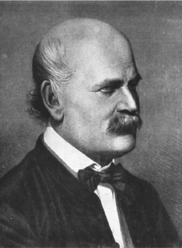
Ignaz Semmelweis
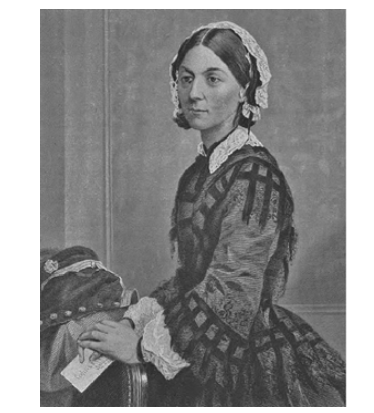
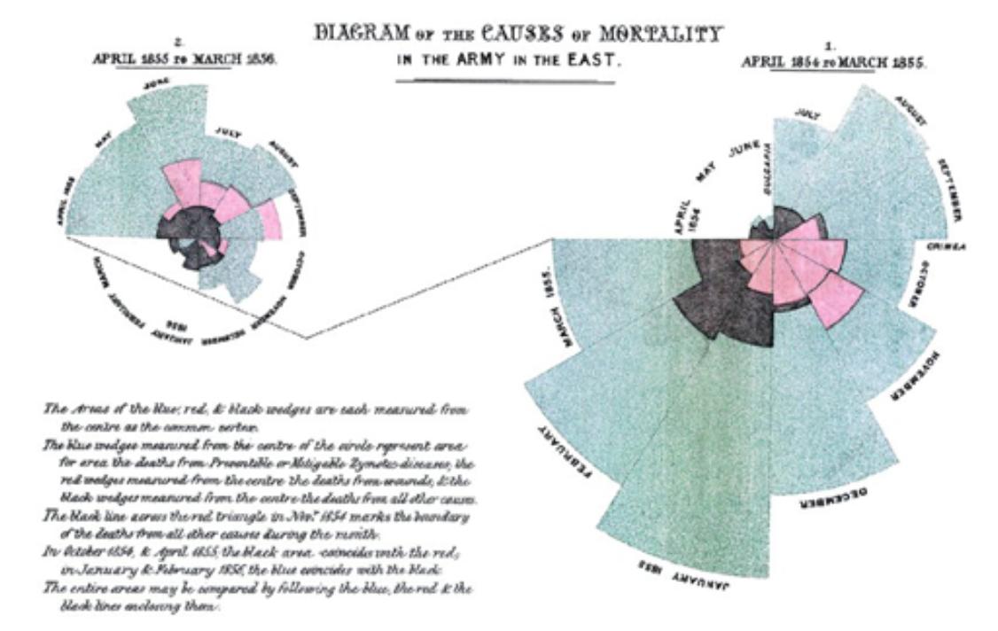
Florence Nightingale
Who recognizes the name or image of: Ignaz Semmelweis - sorry for the pronounciation- and who recognizes Florence Nigthengale?
Now let me tell you why.
A mystery in the maternity ward
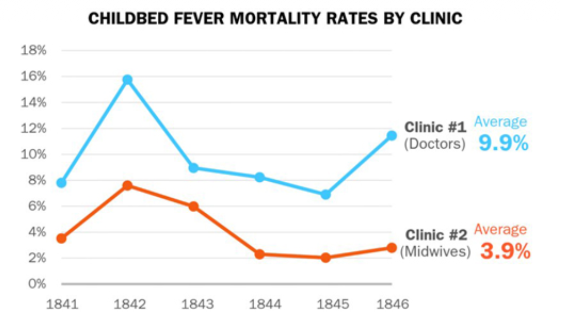
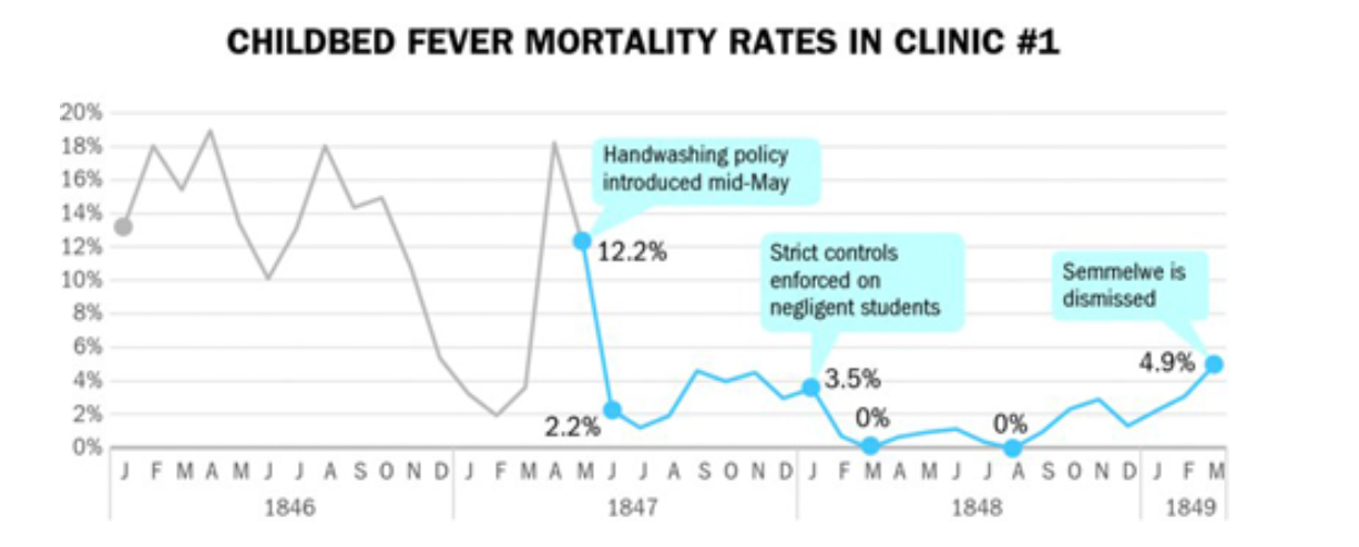
Semmelweis was appointed to the first assistant to the professor of obstetrics at a Vienna maternity hospital in 1846.
Many patients were dying of (puerperal) or childbed fever including seemingly healthy women. Expecting women would suddenly become ill and die shortly after birth.
Semmelweis decided to investigate. At this hopital there was a clinic for training doctors and another for midwives. He noticed a pattern. At this time germs or infections were not known so people thought the issue could be bad air ‘miasma’, overcrowding, cold temperature or delivery methods.
An answer!?
Semmelweis had a breakthrough at a terrible price. A friend and teacher died shortly after they were accidently poked by a student’s scapel during an autopsy. His symptoms before dying were similar to the women experiencing childbed fever.
The training doctors often started their day performing autopsies while the midwives did not. Semmelweis hypothesized that some sort of ‘poisonous’ particles were being transmitted to the mothers from the cadavers in the morgue.
He found a chemical solution that was able to remove the smell of ‘autopsy tissue’ from the doctors’ hands.
He experimented with a hand washing policy that dramatically reduced the mortality rate, including some months of 0 deaths!
Without a theory, however, he was not able to renew his position at the training hospital. Other doctors mocked and critized his ideas.
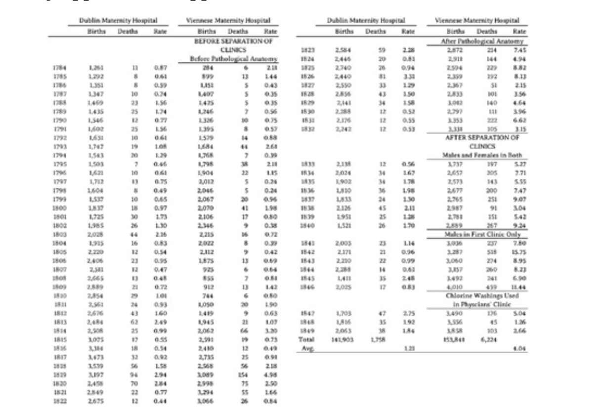
Semmelweis even published a book with over 60 tables and NO charts!
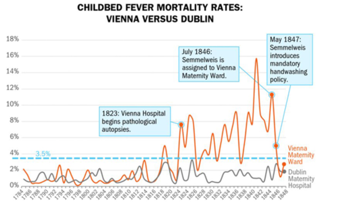
This chart is similar to a modern difference-in-differences approach. It compares the mortality rates of the Dublin Maternity hospital to the one in Vienna before and after 1823 . That was the year the hospital introduced autopsies as part of its practice.
rebut: AI, tylenol (acetaminophen) are examples of adoption without understanding the mechanism/theory.
Now?
In 1858 Nightingale became the first female Fellow of the Royal Statistical Society in England.
During the Crimean War (1853-1856) the British public found out about the horrible conditions of woudned soldiers. In response Nightingale led a team of 38 nurses to assist.
Nightingale fought resistance from male doctors to improve “cleanliness, sanitation, ventilation nutrition, and” other factors. This dropped mortality rates from 42% to 2%!
When she returned she was a famous national icon and was granted a meeting with Queen Victoria. Nightingale managed to gain permission to investigate the health conditions of the British Army.
Working with statistician William Farr, she produced this chart to show some of her results. This is called a polar area diagram and it was given out in pamphlets to the public and distributed widely. She also did not understand the mechanism, however, she was able to change the policy of the Army in regards to sanitation procedures.
[ British soldiers aged 20 - 35 had 2X mortality rate of civilians.]
How about now?
How about now?
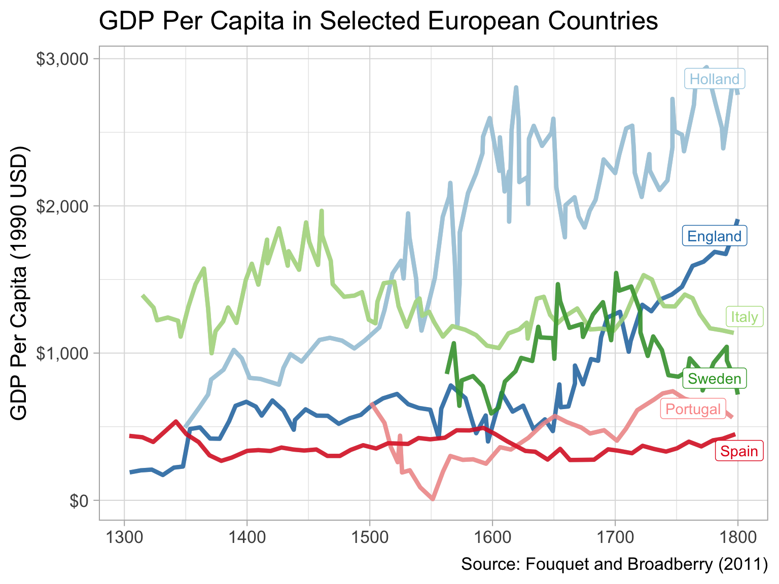
This is the data from the table I showed you that Semmelweis created showing mortality rates for the hospital in Dublin compared to his in Vienna.
Critical thinking
Need to think about what our goals are and who our audience is when we decide how we want to present our findings.
there was racism against hungarians vs Nightingale fame
his desire for precision and detail vs quick communication.
This is a critical thinking skill that requires you to understand your data and what story you are trying to tell.
Especially outside of academia being able to think about how to convince an audience of a story using visuals is very important. We are more likely to be in the situation of Semmelweis or Nightingale and not necessarily understand the mechanism but wanting to convince a boss of our ideas. This is useful in the private sector, politics or for non-profits. Decisions have to be made even if there is not enough data or understanding.
With AI eating up coding jobs it is your ability to choose the correct form of storytelling to convince others, but also to enhance your own understanding of a problem. I think the most important skill to take from the project is critical thinking and deciding how to use images to argue.
Images can often allow people to convince themselves more than you could by talking or writing.
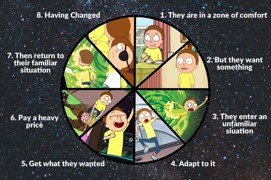
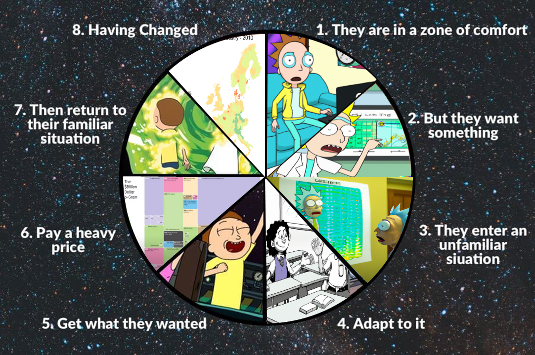
Dan Harmon’s Story Circle
So Dan Harmon also wrote Rick and Morty. Can I get a show of hands, who has seen Rick and Morty?
Great! So Dan Harmon has this idea of the story circle. It is a way to structure a story, demonstrated here with an eight part pie chart showing an example of a Rick and Morty episode.
Read the parts of the story circle out loud.
Our Story Circle
Zone of comfort: Data in excel
Want something: to be better at communicating with your data
Enter an unfamiliar situation: Looking closely at maps and charts
Adapt to it: Practice discussing the differences
Get what they wanted: Banging chart skills
Pay a heavy price: Hard to concentrate - relax with an inspiring video
Return to familiar situation: your projects
Having changed: I hope you learn something.
Improving your maps
Legend breaks
Recap from Lab 1 exercises
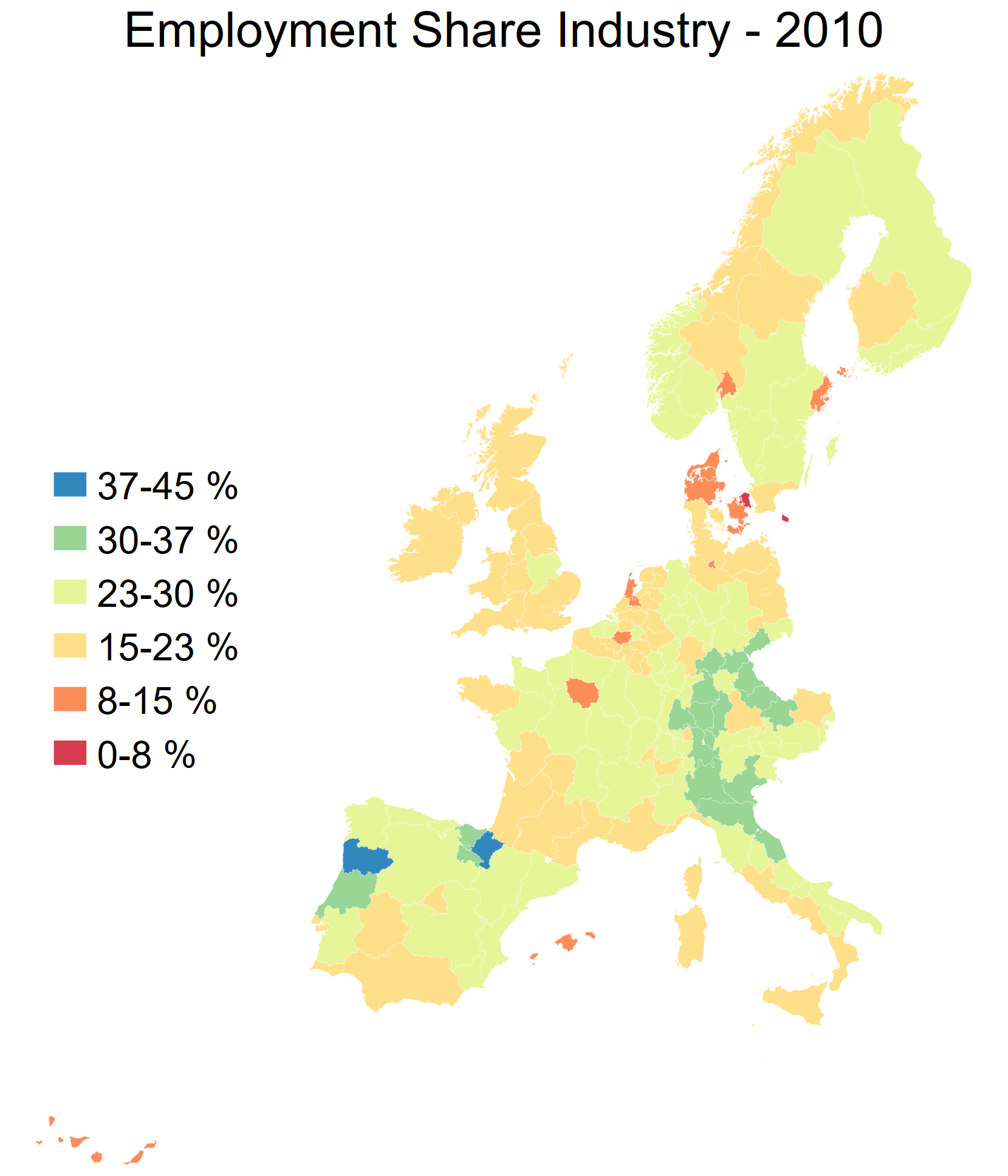
Make a map of the share of employment in industry in the year 2010 across the whole dataset
Recap from Lab 1 exercises
Discuss with your neighbour:
What do we like?
What is confusing?
"nutscoord.dta" if year == 2010 , id (_ID) fcolor (Spectral) legstyle (2 ) title ("Employment Share Industry - 2010" , size (large)) osize (0.02 ..) ocolor (white ..) clmethod (custom) clbreaks (0 (0.2 ) 1 )legend (pos (9 ) size (medium) rowgap (1.5 ) label (6 "80-100 %" ) label (5 "60-80 %" ) label (4 "40-60 %" ) label (3 "20-40 %" ) label (2 "0-20 %" ) label (1 "No Data" )) ndfcolor (gray) ndocolor (white ..) ndsize (0.02 ..)
So I am going to ask you to turn to your neighbour, and discuss what you like about this map, and what is confusing about it.
You should hear a sound when the time is up. I’m really proud of the countdown timer and the sound in the slides and will be very sad if it doesn’t work, but if it doesn’t, I’ll just shout.
Okay - what do we think? Feel free to raise your hands if you want to report back.
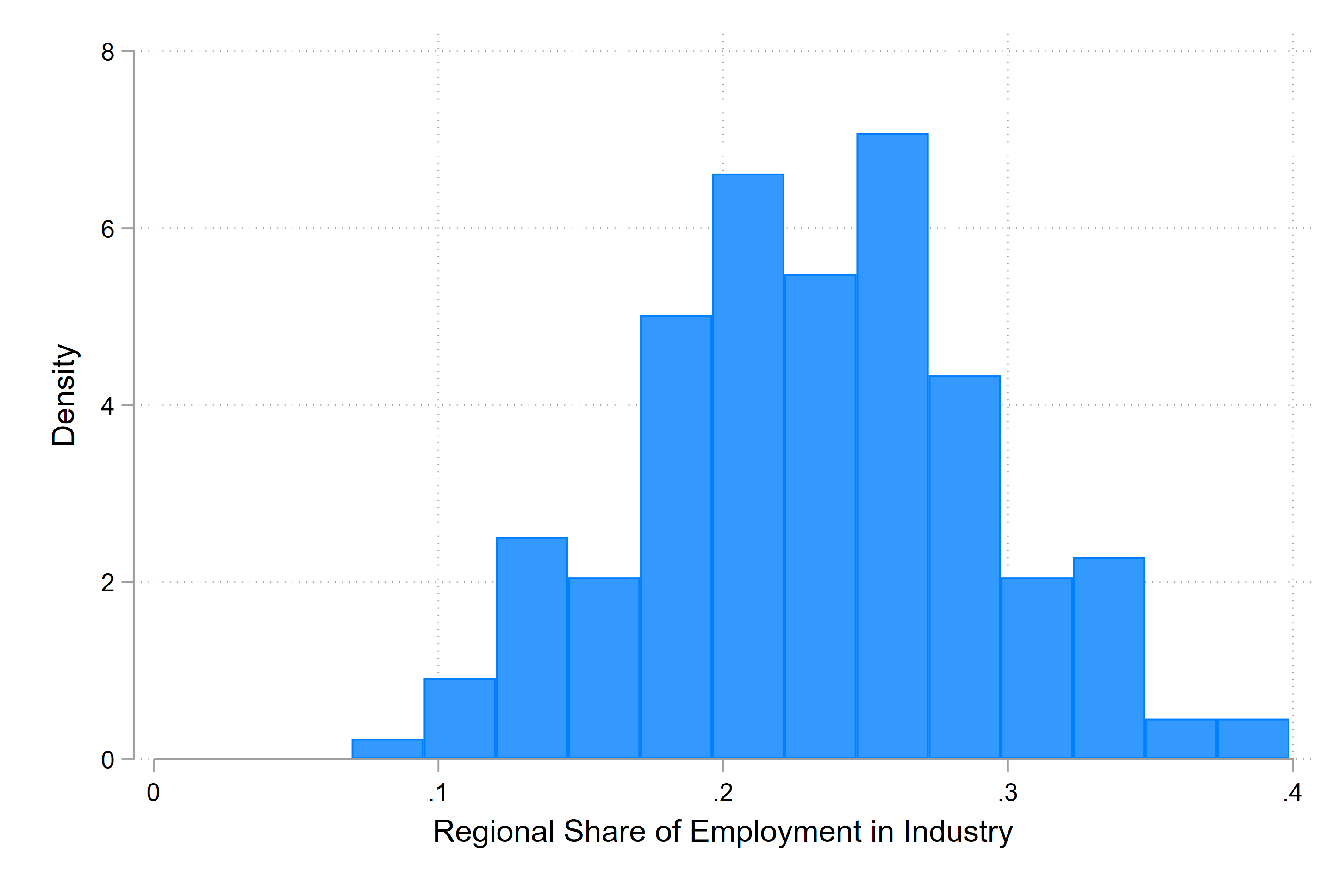
Let’s plot the distribution of the data
if year == 2010 , color (midblue)
So in Stata we can make a histogram of our data with the hisogram command. This allows us to see the distribution of the data - for each region in the dataset, we look what the value is of regional share of employment in industry, and we count that value and add it to the bin.
Here we can see that all of the data lies between about 0.08 and .4 - in percentage terms that means that the share of employment in industry is between 8 and 40 percent in 2010 across our dataset.
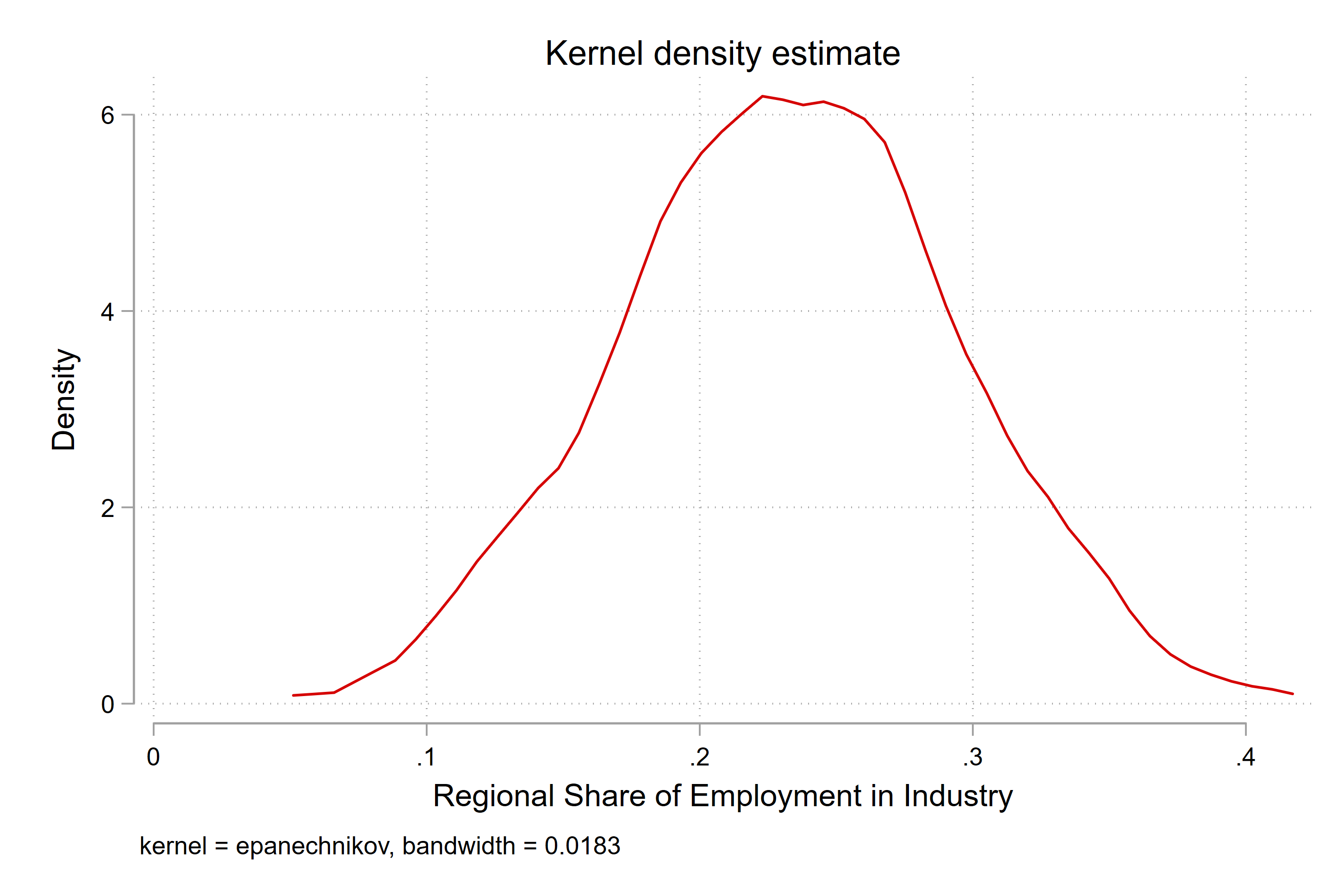
Let’s plot the distribution of the data
if year == 2010
We can also use what is called a kernel density plot to show the distribution of the data. This is a smoothed version of the histogram, where we can see the distribution of the data in a more continuous way.
What can we say about the shape of the distribution?
Colour scales
Uses of color in data visualization
1. Distinguish categories (qualitative)
Now we are going to talk about the different types of colour scales that we can use in data visualization.
We looked yesterday at some sequential palettes, like the Blues2 palette that comes standard in Stata.
There are also other type, including qualitative palettes, which are used to distinguish between different categories.
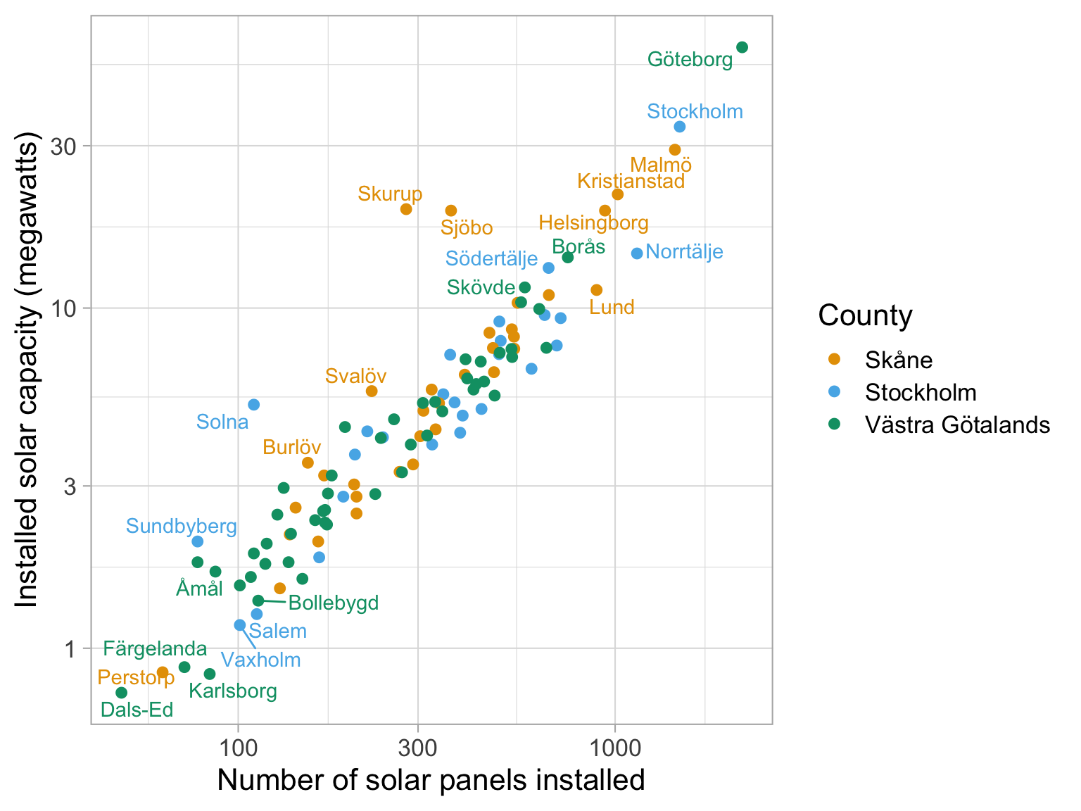
Qualitative scale example
Palette name: Okabe-Ito
In this graph I have chosen to plot some data about the number of solar panels installed in various Swedish towns, and the installed capacity of those solar panels.
The data isn’t important in this case, but we can see that there is a strong linear relationship between the number of solar panels installed and the installed capacity of those solar panels.
In this case, we might want to distinguish between different counties in Sweden, and so we use a qualitative palette to do so.
We can see that there are both the largest number of panels and the largest installed capacity in Gothenburg, followed by Stockholm and Malmö - which makes sense.
In this instance, we can choose colours that distingish between the different counties, and we can see that the Okabe-Ito palette is a good choice for this. We aren’t saying that this town is ‘more Skane’ than others, so a sequential palette is not appropriate.
Qualitative scale example
Palette name: Brewer Set1
Qualitative scale example
Palette name: Brewer Dark2
Uses of color in data visualization
1. Distinguish categories (qualitative)
2. Represent numeric values (sequential)
The next palette is a sequential palette, which is used to represent numeric values, or numbers that are ordered in some way.
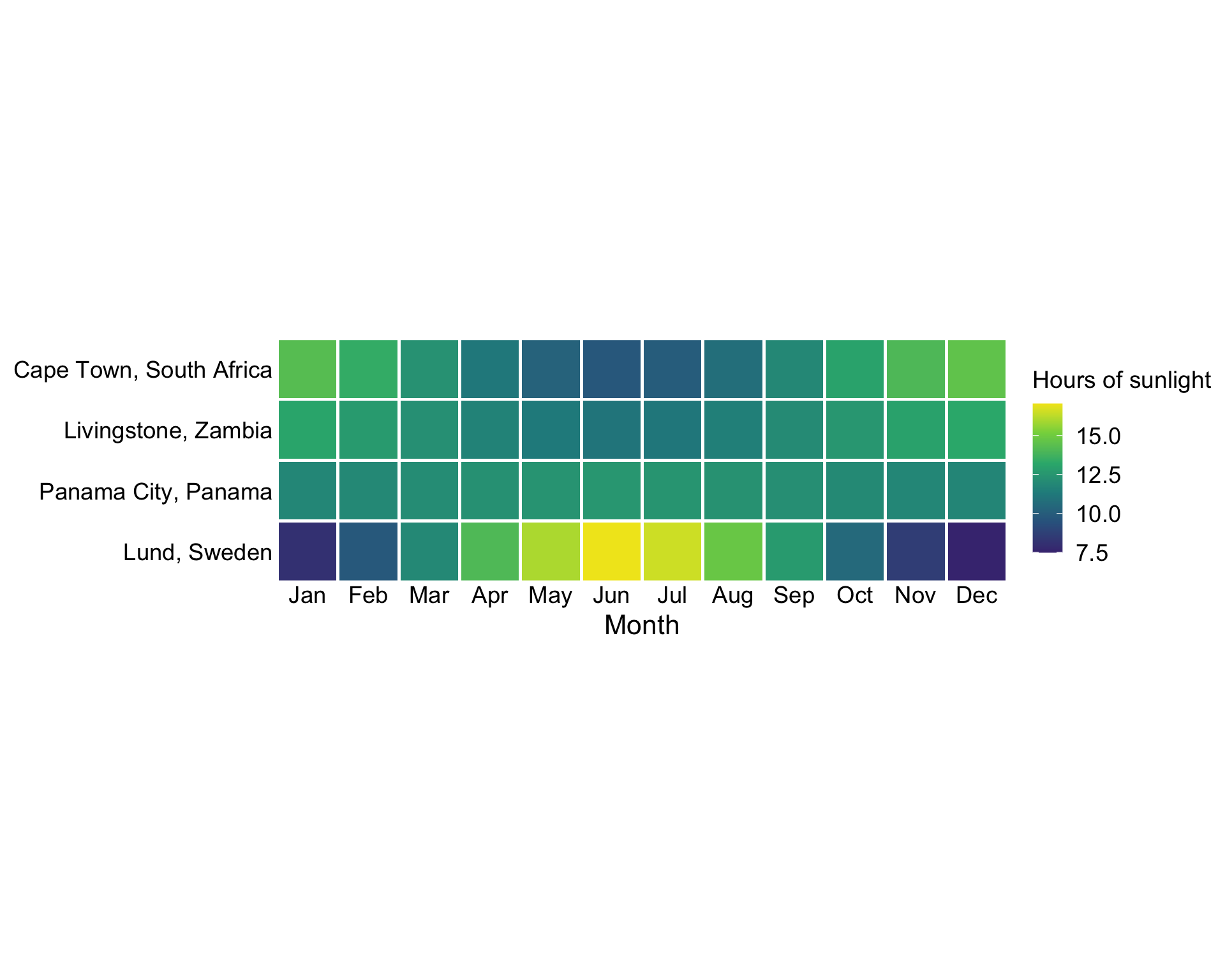
Sequential scale example
Palette name: inferno
Here we are looking at the number of hours of sunlight in different cities around the world.
We can see that in Lund, because we are quite far North, we have very few hours of sunlight in the winter, and a lot of hours of sunlight in the summer.
In contrast, Panama City has a very consistent number of hours of sunlight throughout the year as it lies near the equator.
We can also see that in Cape Town and Livingstone Zambia we have the reverse pattern to Lund - with more hours of sunlight in the winter than in the summer.
The inferno sequential palette is a good choice for this data, as it shows the progression of the number of hours of sunlight in a clear way.
For a sequential palette, you want the person looking at your plot to be able to see clearly the progression of the data, as well as which is high and which is low. I think in this case it makes sense to use the brighter end of the scale as high, because we associate it with sunlight - quite neat!!.
Sequential scale example
Palette name: viridis
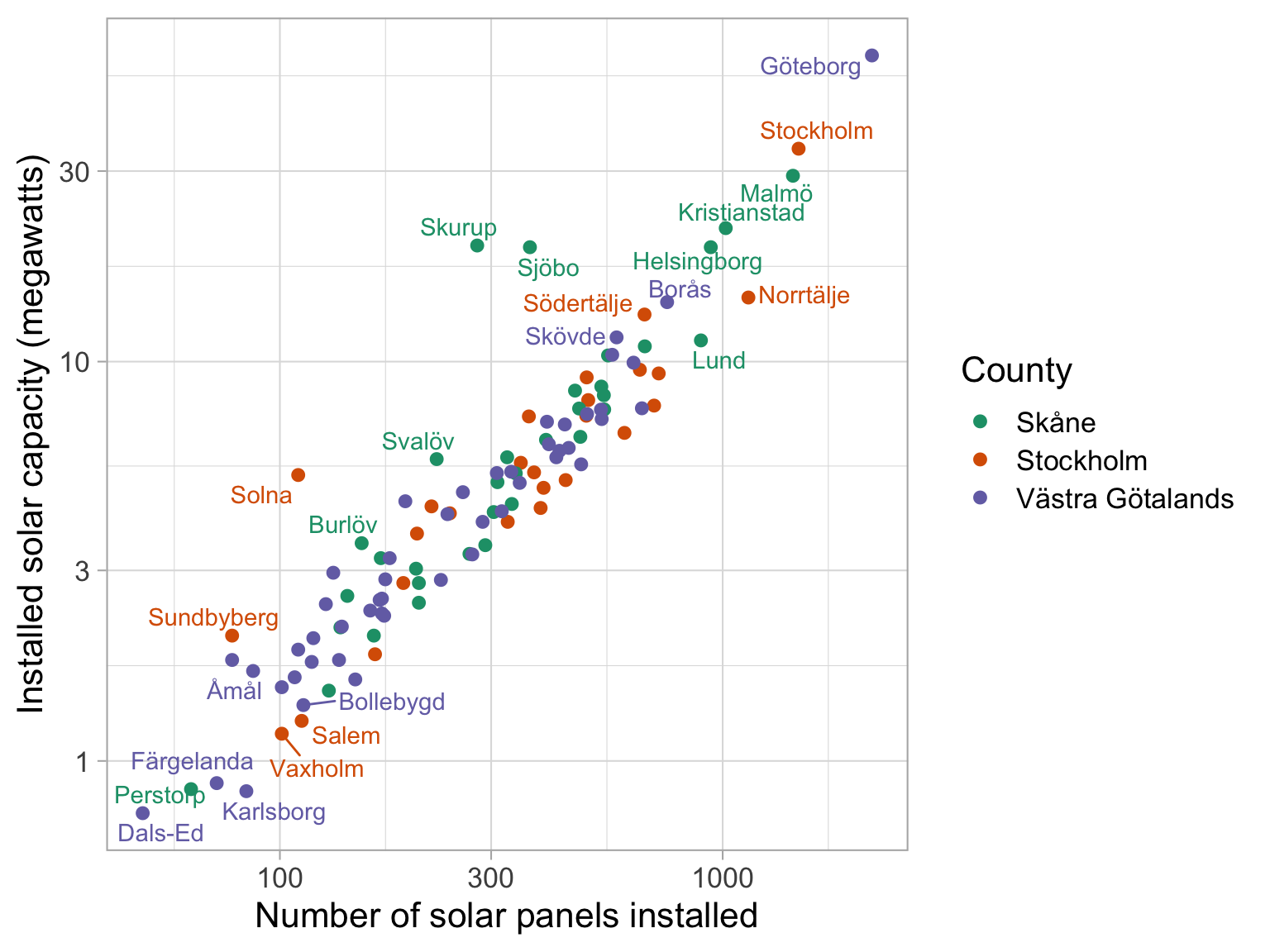
Diverging scale example
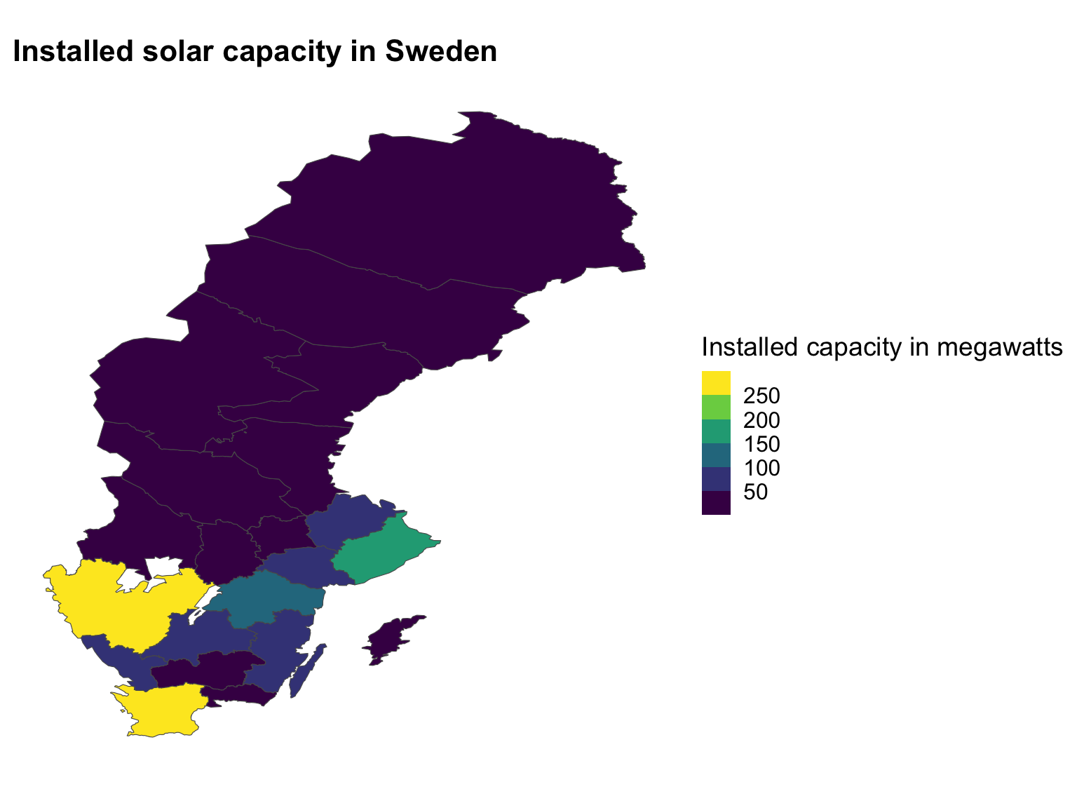
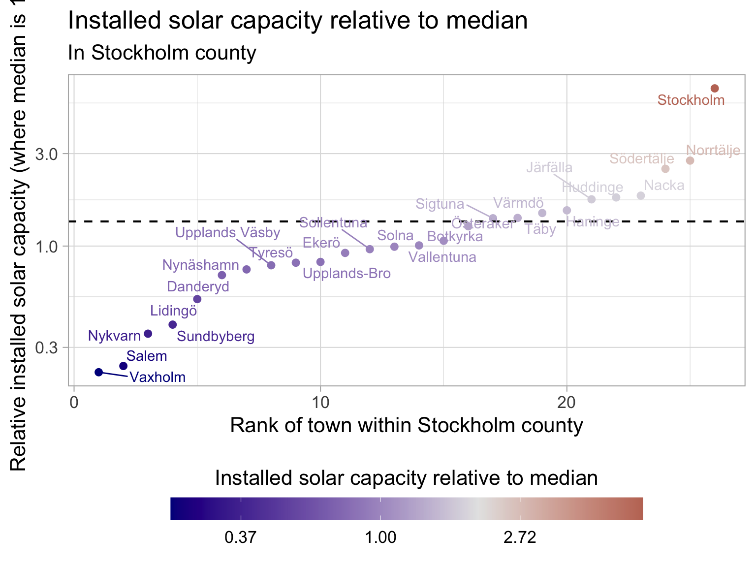
In this instance, we are looking at the solar panel data that we had before, this time, just in Stockholm county. We want to know how far each point is away from the median value of installed solar capacity in Stockholm county - and we can see that the red values are high, and the blue values are low, while the median is a white colour.
In this case we have a log scale on the y-axis because the data is quite skewed, and we want to be able to see the differences between the points more clearly. So Stockholm city has almost 10X the median installed solar capacity in the county.
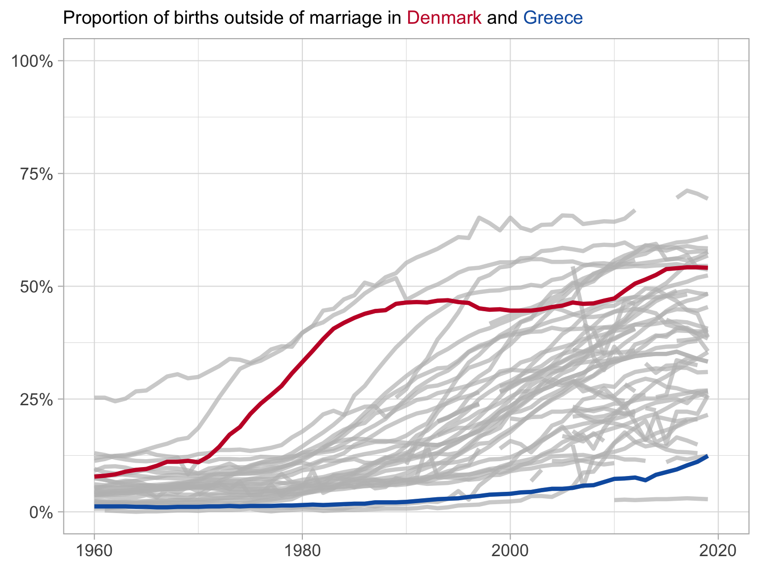
Highlight example
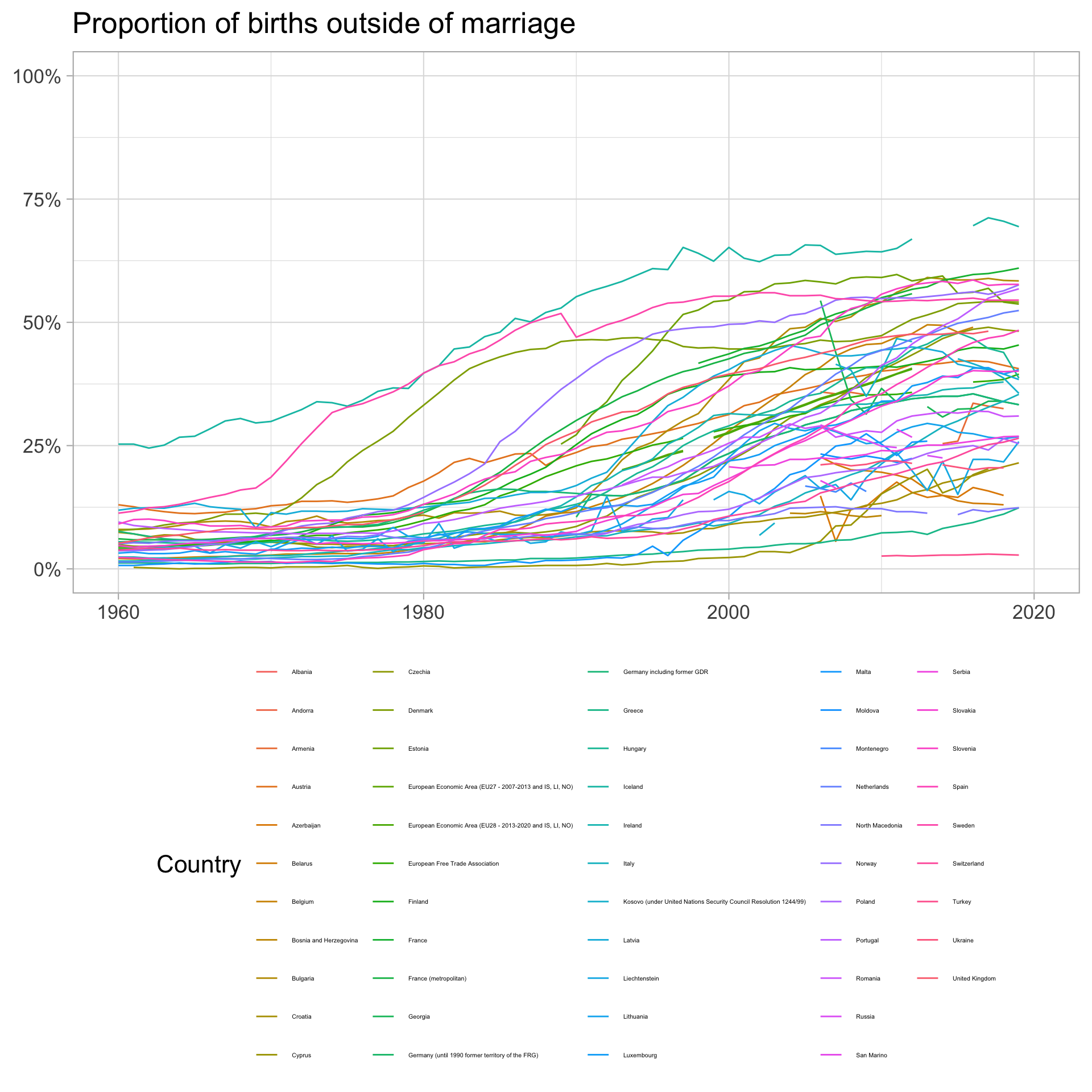
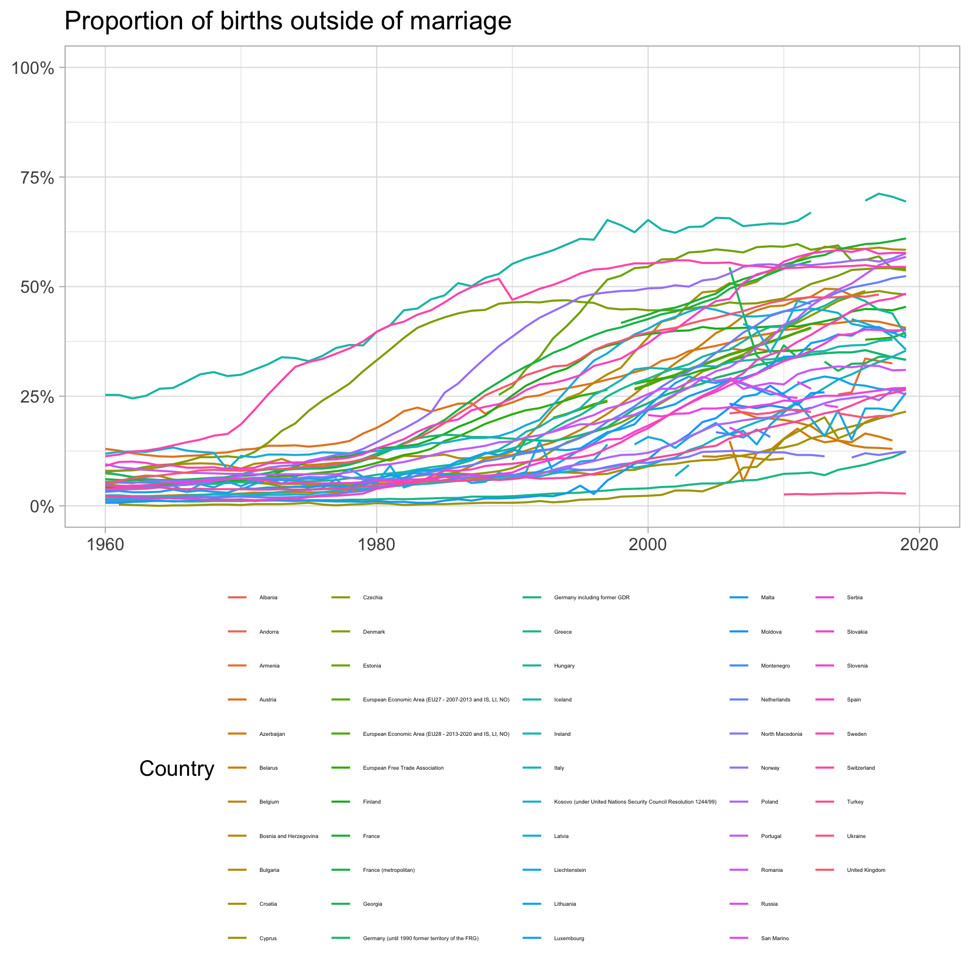
In this example, we have information on the share of children born outside of marriage in Europe.
We have a lot of lines, and we are interested in highlighting two countries in order to compare them over time.
We can see that in Denmark, the share of children born outside of marriage was higher than Greece in 1960, and then really increased in 1970 to about 1990, before levelling off somewhat at about 50% of children born outside of marriage.
In contrast, in Greece, the share of children born outside of marriage was very low in 1960, and because of the importance of the Orthodox church in Greece, it has remained low throughout the period, only increasing to about 12,5% in 2021.
I did another neat thing here, where I used the markdown in the title to colour the country names in the legend to match the colours of the lines. This way we don’t need to have a legend and a title, and we can save some space on the plot. I also used the colours from the flags of the countries, which is a nice touch, if I do say so myself.
Using density plots to set your legend breaks: quick example
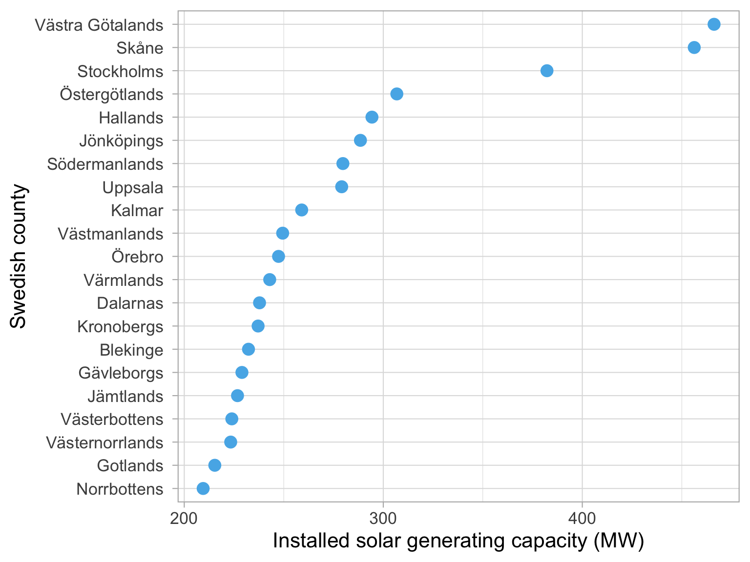
Dataset: Solar panels in Sweden
Year: 2021
Västra Götalands län
266.21
Skåne län
256.25
Stockholms län
182.25
Östergötlands län
106.81
Hallands län
94.31
Jönköpings län
88.53
Södermanlands län
79.71
Uppsala län
79.11
Kalmar län
59.01
Västmanlands län
49.45
Source: Energimyndigheten
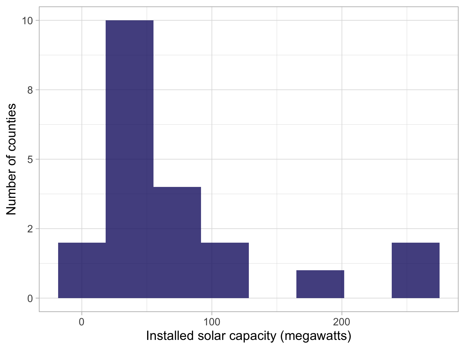
Let’s recap quickly, we have a dataset of solar panels in Sweden, and we are interested in the installed capacity of solar panels in different counties in Sweden.
We want to make a choropleth, or a map that is coloured based on the installed capacity of solar panels in each county.
How to decide on values for the bins?
Use a histogram or a density plot to see where the weight of the distribution is.
How do we decide on the values for the bins in our choropleth?
Let’s make a histogram of the installed capacity of solar panels in the different counties in Sweden.
We can see the range goes from zero to about 300.
Map with appropriate breaks
Ask your neighbour:
what kind of palette is this?
Is it appropriate to use with this data?
So have a look at this map that we have created - and tell me what kind of palette is this, and is it appropriate to use with this data?
Let’s take 1 minute to discuss with your neighbour.
-Sequential
Improving your maps
Great Choropleths
Examples of great maps
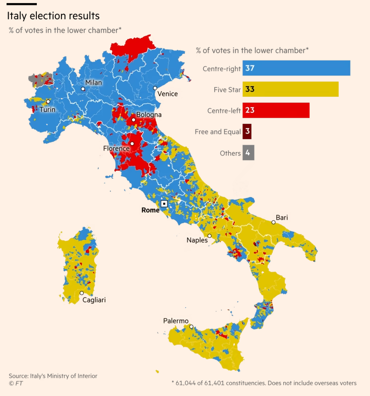
Financial Times analysis of Italian election results in 2018
This is a map from the FT showing the results of the Italian elections in 2018. You can all get access to the FT through Lund and I think it’s a really great resource for data journalism and data visualization.
Maps work best when they show an emerging spatial pattern, as was the case with this map from the recent Italian elections.
Showing the winner at municipality level clearly shows the political divisions in the country. In the north, the Northern League party triumphed largely on the back of an anti-immigration and anti-EU agenda. In the south, the anti-establishment Five Star Movement was even more successful, gaining a majority of votes in many areas.
What is also clever as that they have used a column chart in the map in order to help us understand the aggregate vote share for the main parties.
What kind of palette do you think they have used here? Sequential, qualitative or diverging?
A: qualitative, because they are showing the winner in each municipality.
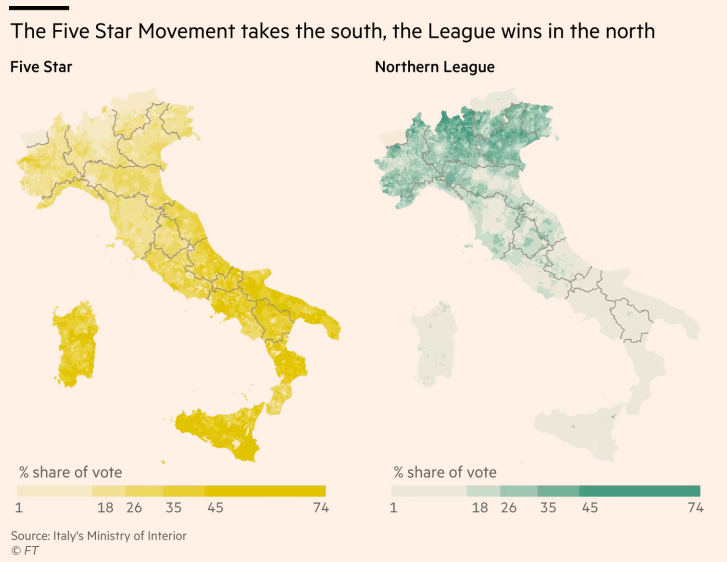
Examples of great maps
Financial Times analysis of Italian election results in 2018
Another interesting take on the results was to show the per cent share of vote. This helped to emphasise just how strong the support was for the two parties.
What kind of palette do you think they have used here? Sequential, qualitative or diverging?
A: Sequential, because they are showing the share of the vote in each municipality for two main parties they want to compare.
Another thing I should mention is that they have been quite clever with the legend - you can see here the breaks are in specific places, in oder to best show that the Norhtern League’s support is really concentrated in the North, and the Five Star Movement’s support is really concentrated in the South and Sicily. [ break at 45 etc. note range is same on both - otherwise difficult to compare]
Examples of great maps
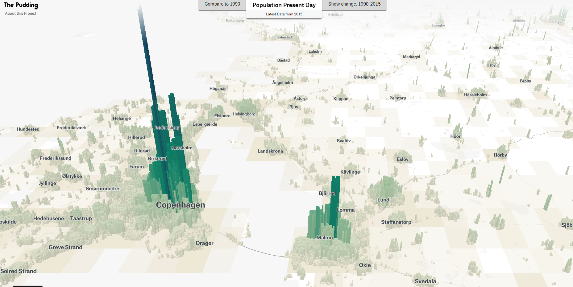
Human Terrain from The Pudding
The other place I really recommend you have a look for inspiration for good data journalism is a website called “The Pudding”. They have some really great data visualizations and data journalism pieces, inclduing this one that shows where people live in countries.
Here i have a screenshow of the map showing the Oresund region, and we can see how centered the population is in Copenagenhagen and Malmo, and how the population density drops off as we move away from the cities to smaller towns.
I will say that this is based on buildings and not people, so it is not a perfect representation of the population, but it is a really interesting way to show where people live in a country. Here you can see the Oresund bridge looks like it has people living on it, but that is not the case in reality.
Let’s have a look at some other places - who has visited Japan before? Compare population growth…
Overcoming Excel
Motivation
Overcoming Excel
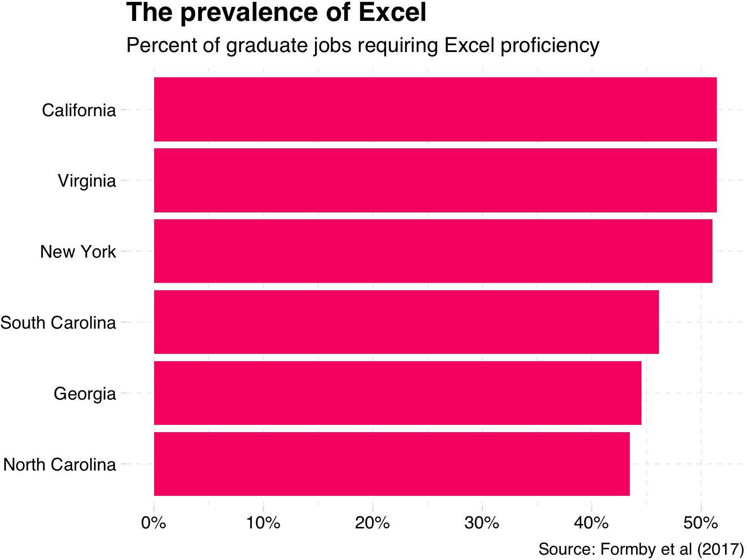
Excel itself is not a bad tool.
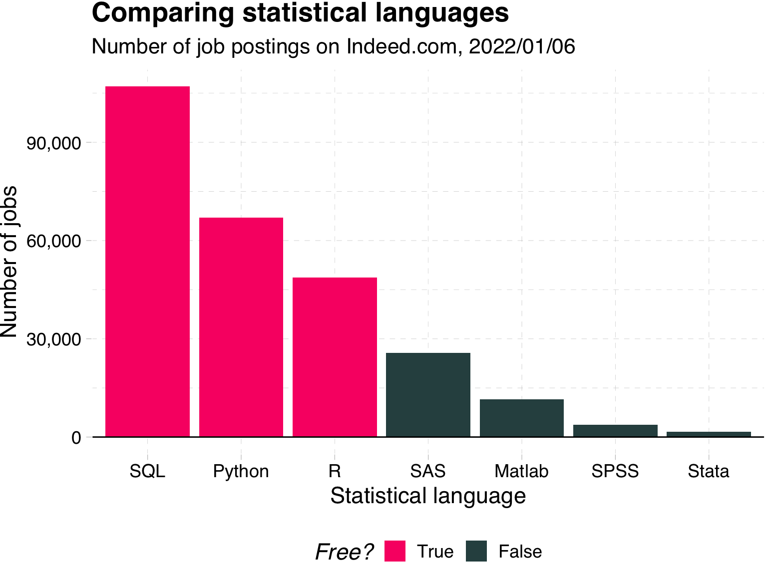
It is very popular! See the info on jobs that require it.
[ Don’t be worried, remember what I said before, this is not project is not about learning stata, but critical thinking and the ability to communicate data in an effective manner.
]
Overcoming Excel
Takeaways:
You will likely use Excel in the future 📊
Excel’s default plots and tables can be improved upon 📈
Simple rules can help you make your message clear 💎
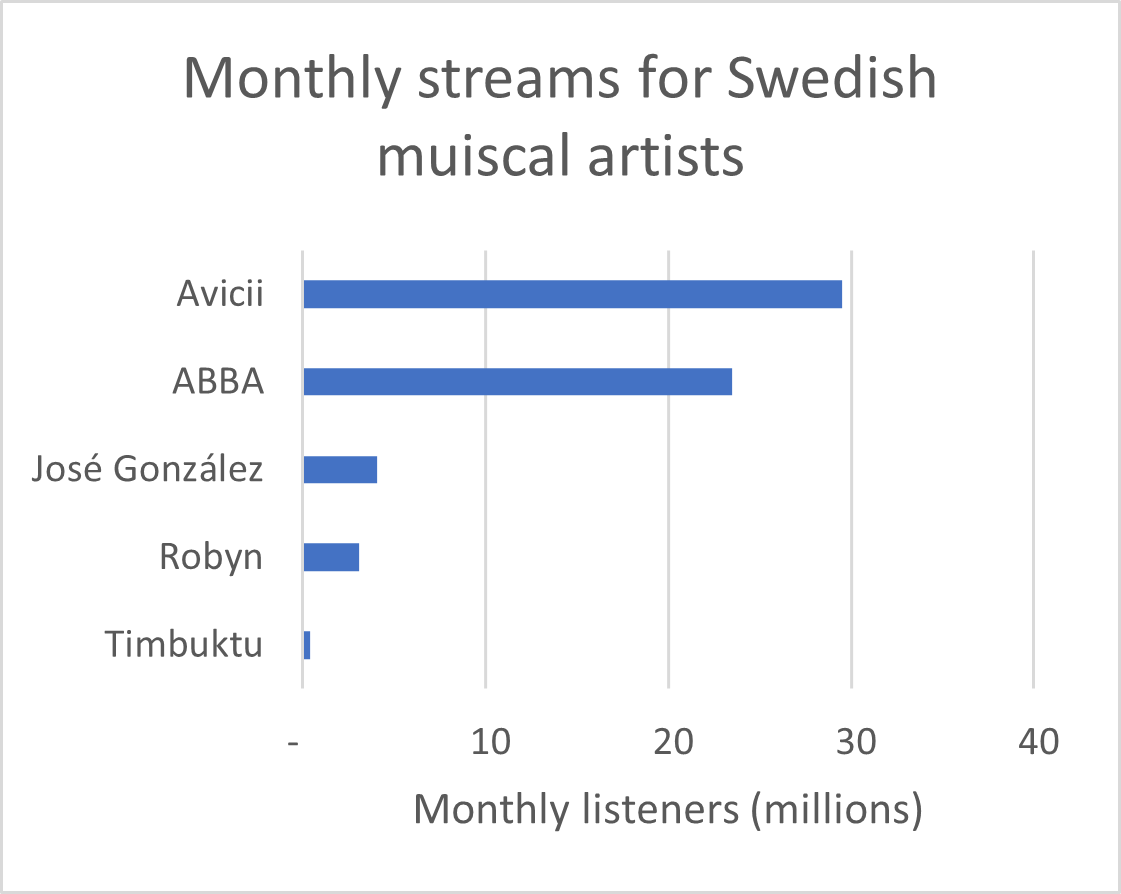
Overcoming Excel: Column plot
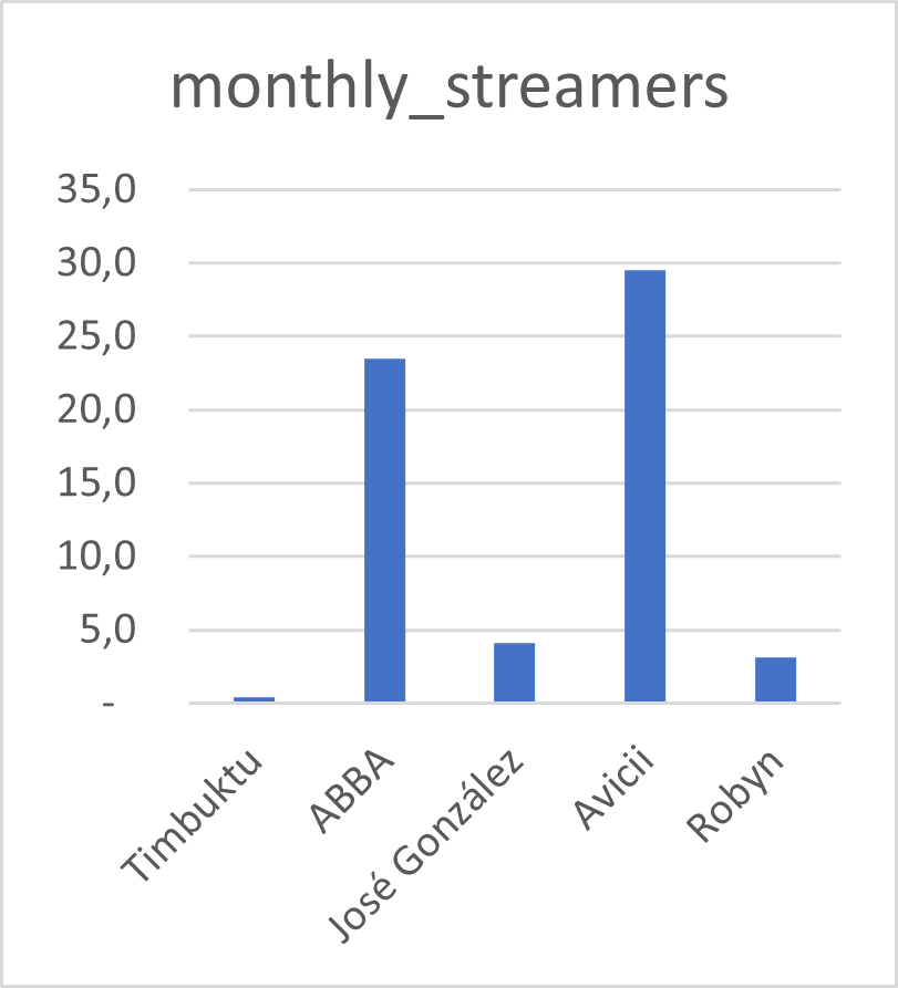
We often encounter datasets containing simple amounts 🤏
Here is some data on a sample of Swedish musical artists 🎵
I put this data into Excel, and asked for a recommended chart 📊
Rank
Artist
Monthly listeners (m)
1
Avicii
29.47
2
ABBA
23.48
3
José González
4.07
4
Robyn
3.11
5
Timbuktu
0.38
Datasource: Spotify charts Nov 2022
Your turn
Discuss with your neighbour:
What do we like?
What is confusing?
Tip 1: Avoid rotated axis labels
Ugly 🤢
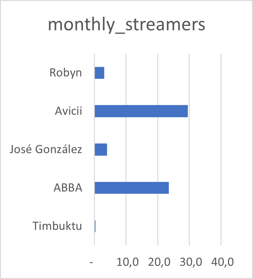
Tip 1: Avoid rotated axis labels
Flip axes so that the text is easier to read 👓
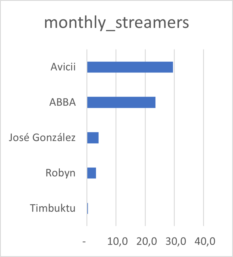
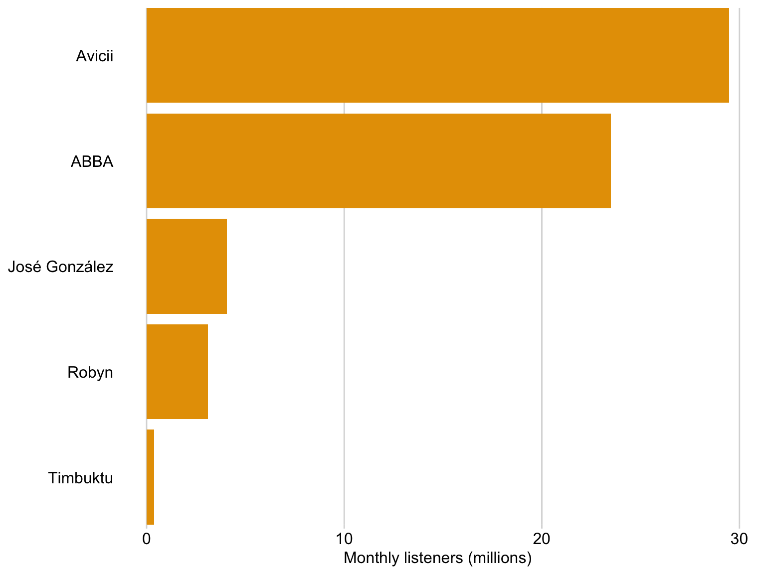
Tip 2: Pay attention to the order of the bars
Bad 👎
Tip 2: Pay attention to the order of the bars
It is clear that José González recieves more streams than Robyn
Tip 3: Consider your titles, labels and axes
Tip 3: Consider your titles, labels and axes
Note the title, x-axis title, x-axis labels 📙
Tip 3: Consider your titles, labels and axes
Titles and captions have different application areas
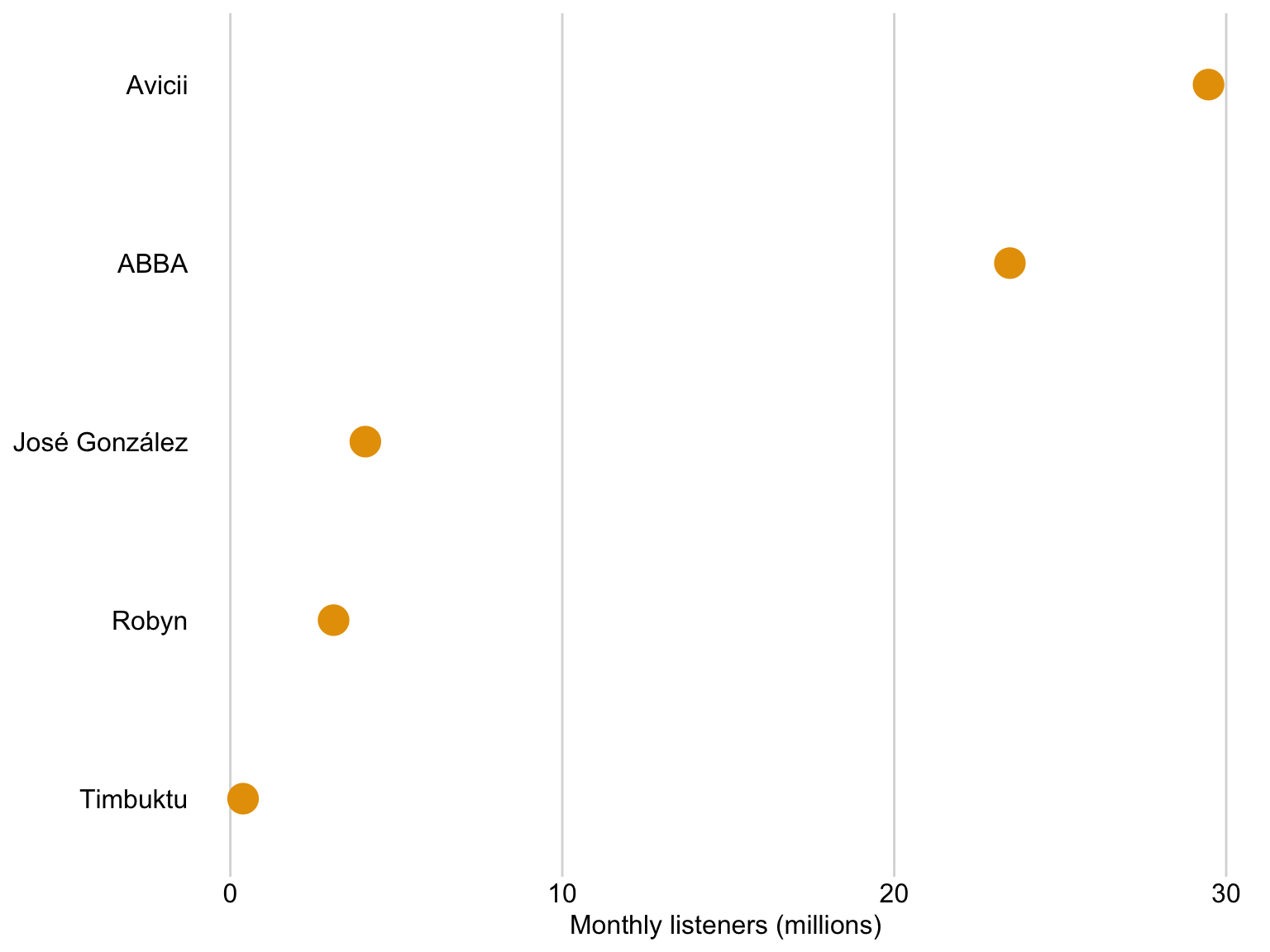
We can use dots instead of bars
We can use dots instead of bars
Dots are preferable if we want to truncate the axes
Dataset: Solar panels in Sweden
Dots are preferable if we want to truncate the axes
Bar lengths do
Dots are preferable if we want to truncate the axes
Key features
Dots are preferable if we want to truncate the axes
Overcoming Excel: Tables
We often encounter datasets containing simple amounts 🤏
Here is some data on a sample of Swedish musical artists 🎵
I put this data into Excel, and asked it to insert a table 🗃️
Rank
Artist
Monthly listeners (m)
1
Avicii
29.47
2
ABBA
23.48
3
José González
4.07
4
Robyn
3.11
5
Timbuktu
0.38
Datasource: Spotify charts Nov 2022
Your turn again
Discuss with your neighbour:
What do we like?
What is confusing?
Number
Rule
1
Do not use vertical lines.
2
Do not use heavy horizontal lines between data rows. (Horizontal lines as separator between the title row and the first data row or as frame for the entire table are fine.)
3
Text columns should be left aligned.
4
Number columns should be right aligned and should use the same number of decimal digits throughout.
5
Columns containing single characters are centred.
6
The header fields are aligned with their data, i.e., the heading for a text column will be left aligned and the heading for a number column will be right aligned.
Source: Claus Wilke’s Fundamentals of Data Visualization
Let’s apply these rules
Number
Rule
1
Do not use vertical lines.
2
Do not use heavy horizontal lines between data rows. (Horizontal lines as separator between the title row and the first data row or as frame for the entire table are fine.)
3
Text columns should be left aligned.
4
Number columns should be right aligned and should use the same number of decimal digits throughout.
5
Columns containing single characters are centred.
6
The header fields are aligned with their data, i.e., the heading for a text column will be left aligned and the heading for a number column will be right aligned.
Source: Claus Wilke’s Fundamentals of Data Visualization
Storytelling with data
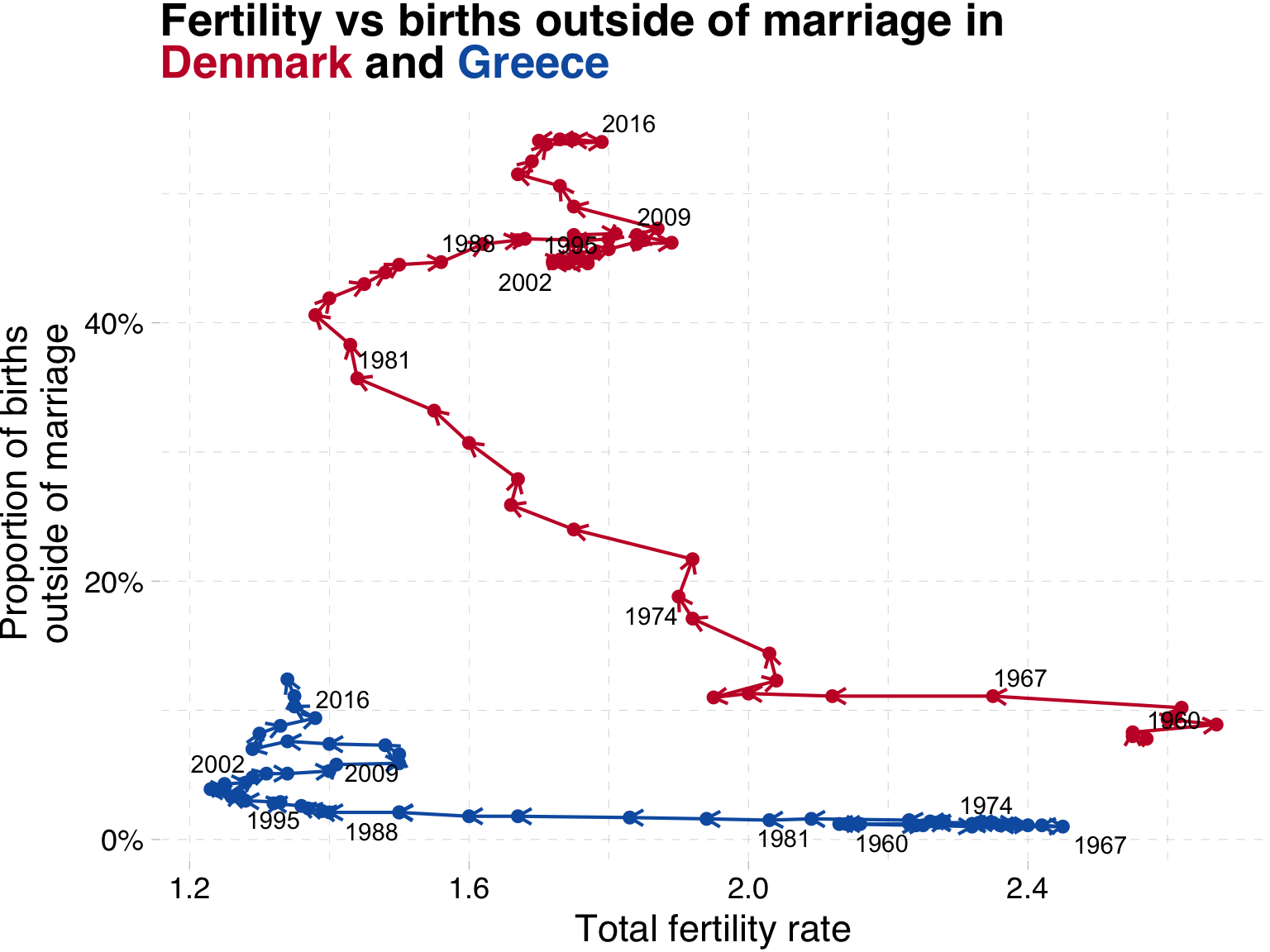
Related time series
An alternative: time on a third axis
What have we learned?
Both countries saw a large drop in fertility from the 1960s until the 1980s
In Denmark, after 1970 we see an increase in the share of children born outside of marriage
In contrast, Greek families have relatively few children outside of marriage.
After 1990, Danish fertility increased from 1.3 to 1.8, while Greek fertility remained at ‘lowest-low’ levels, below replacement.
What have we changed?
Indicators on the x- and y-axis and then show time with text labels
Legend is replaced with colour coded title
Colours have meaning (main colour of country flag)
Percentage labels on the y-axis
Storytelling with data
Giving context
Giving context
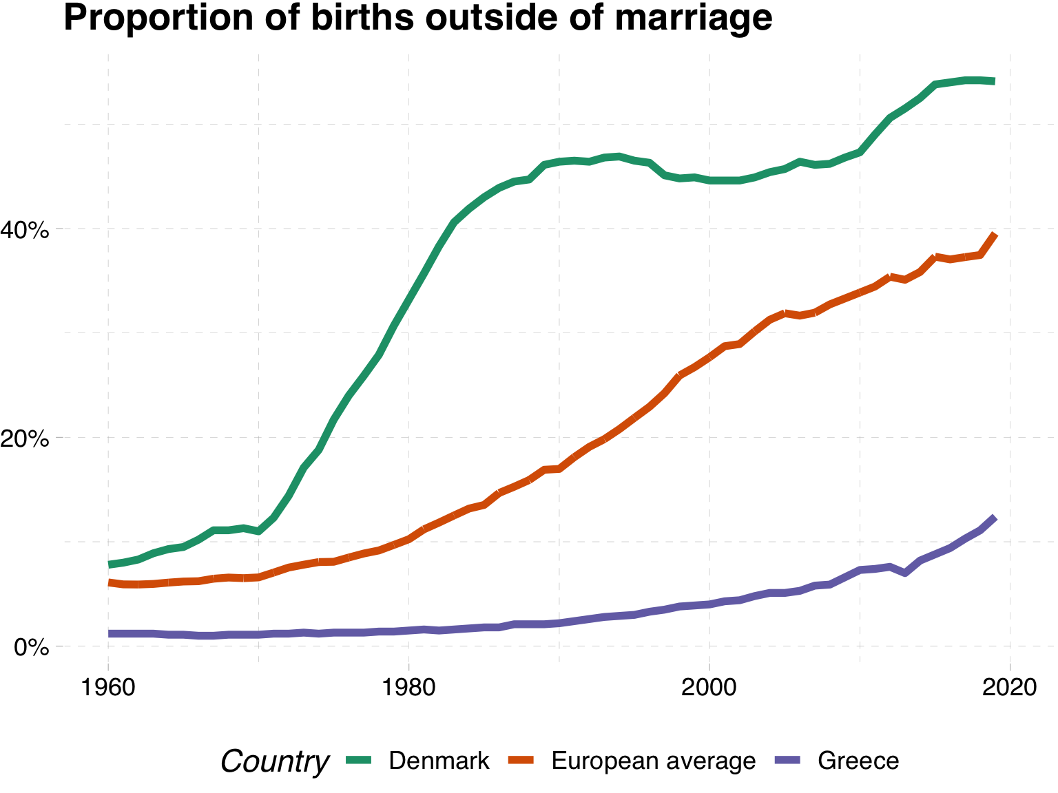
Sometimes we may want to show a particular series of data in its correct context.
For instance, in our line graph above which showed the evolution of the share of births outside of marriage in Denmark and Greece , we might want to know if these two represent the extremes within Europe.
Giving context
Do Denmark and Greece represent the extremes of the share of children born outside of marriage in Europe?
Giving context with an average
One way to do this would be to show an average for Europe
Giving context with an interval ribbon
Giving context with all of the data
This is silly
Giving context with all of the data
Here we highlight the series we are interested in and draw in the remaining series in grey
What have we changed?
Shows each of the series
We can see that Denmark is a leader in the beginning, but is caught up by other nations
Does not hide outliers
Makes clear the trends in your countries of interest
Storytelling with data
Tips for polished figures
You pay a heavy price
VIDEO