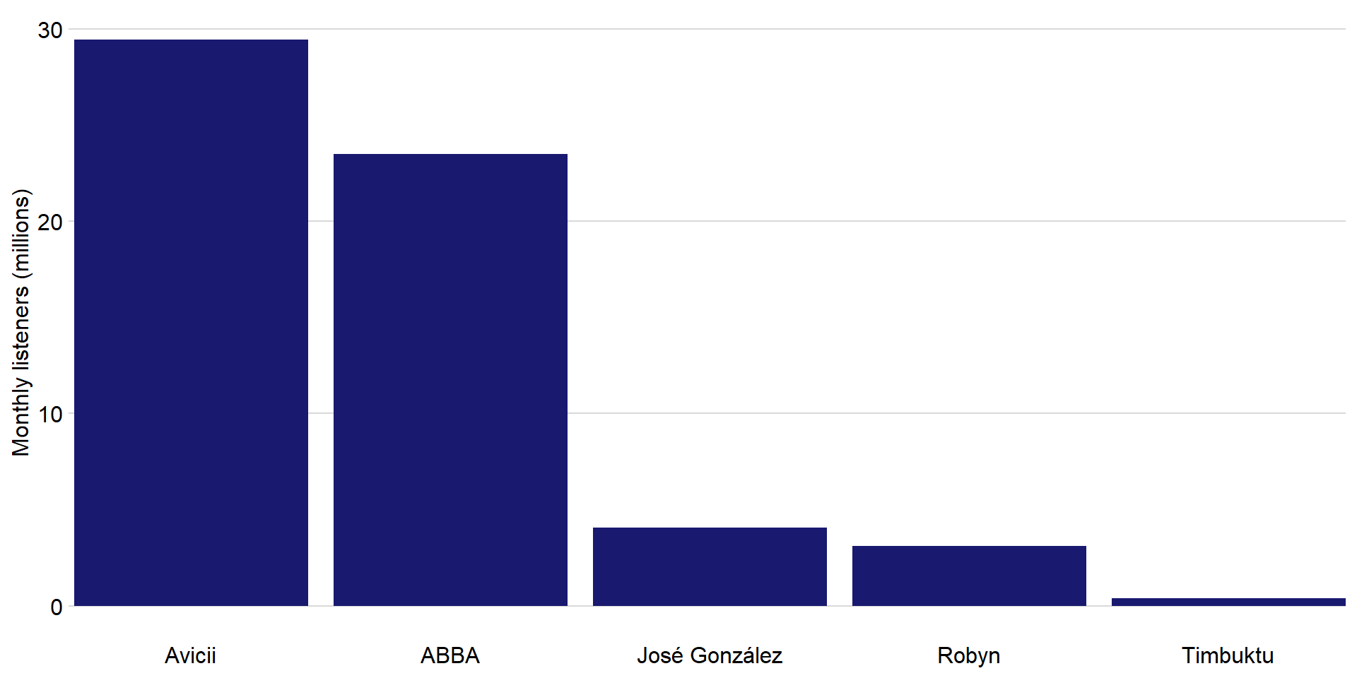
We often encounter datasets containing simple amounts
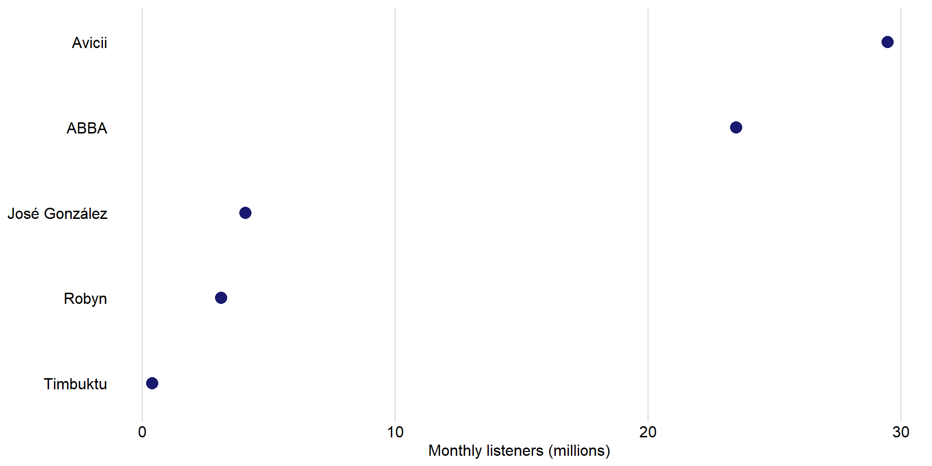
| Rank |
Artist |
Monthly listeners (m) |
| 1 |
Avicii |
29.47 |
| 2 |
ABBA |
23.48 |
| 3 |
José González |
4.07 |
| 4 |
Robyn |
3.11 |
| 5 |
Timbuktu |
0.38 |
We can visualize amounts with bar plots
![]()
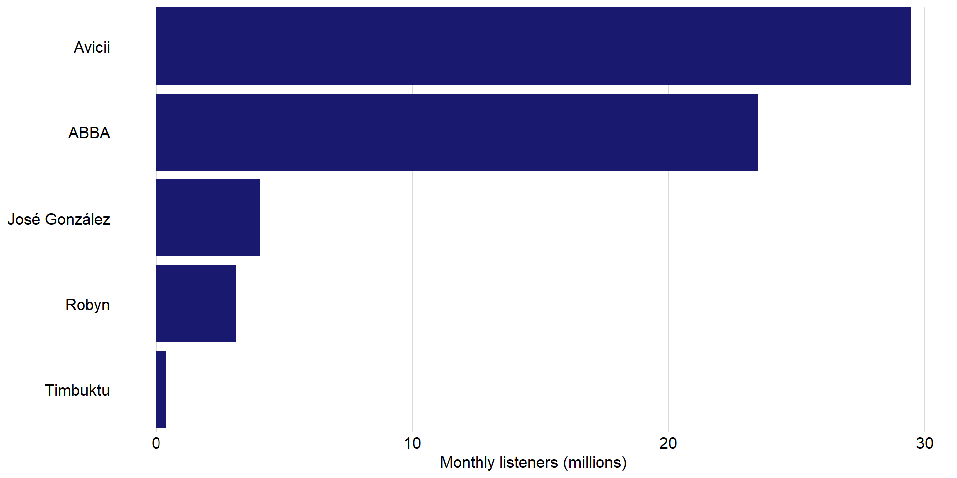
Bars can also run horizontally
![]()
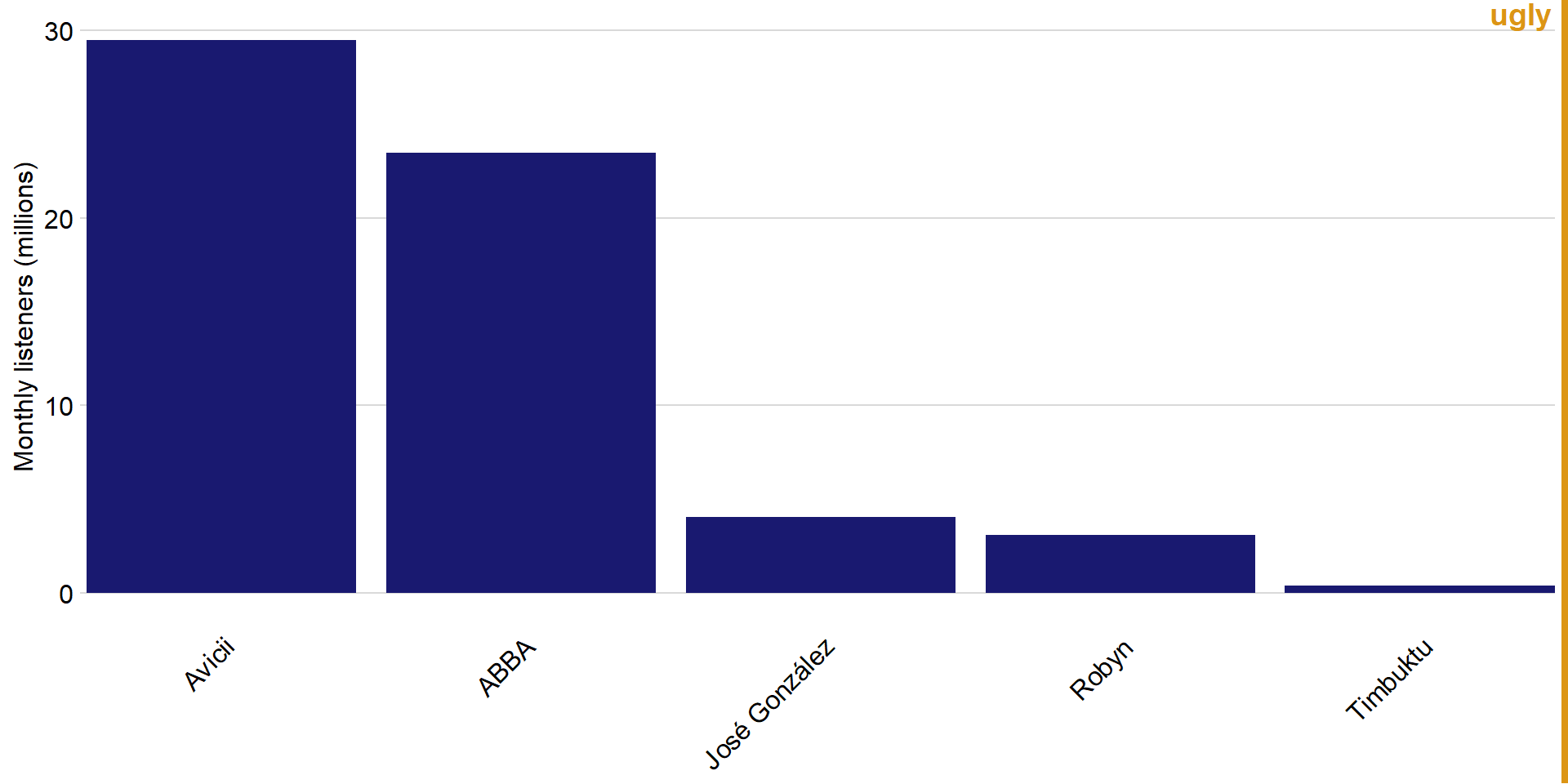
Avoid rotated axis labels
![]()
Avoid rotated axis labels
![]()
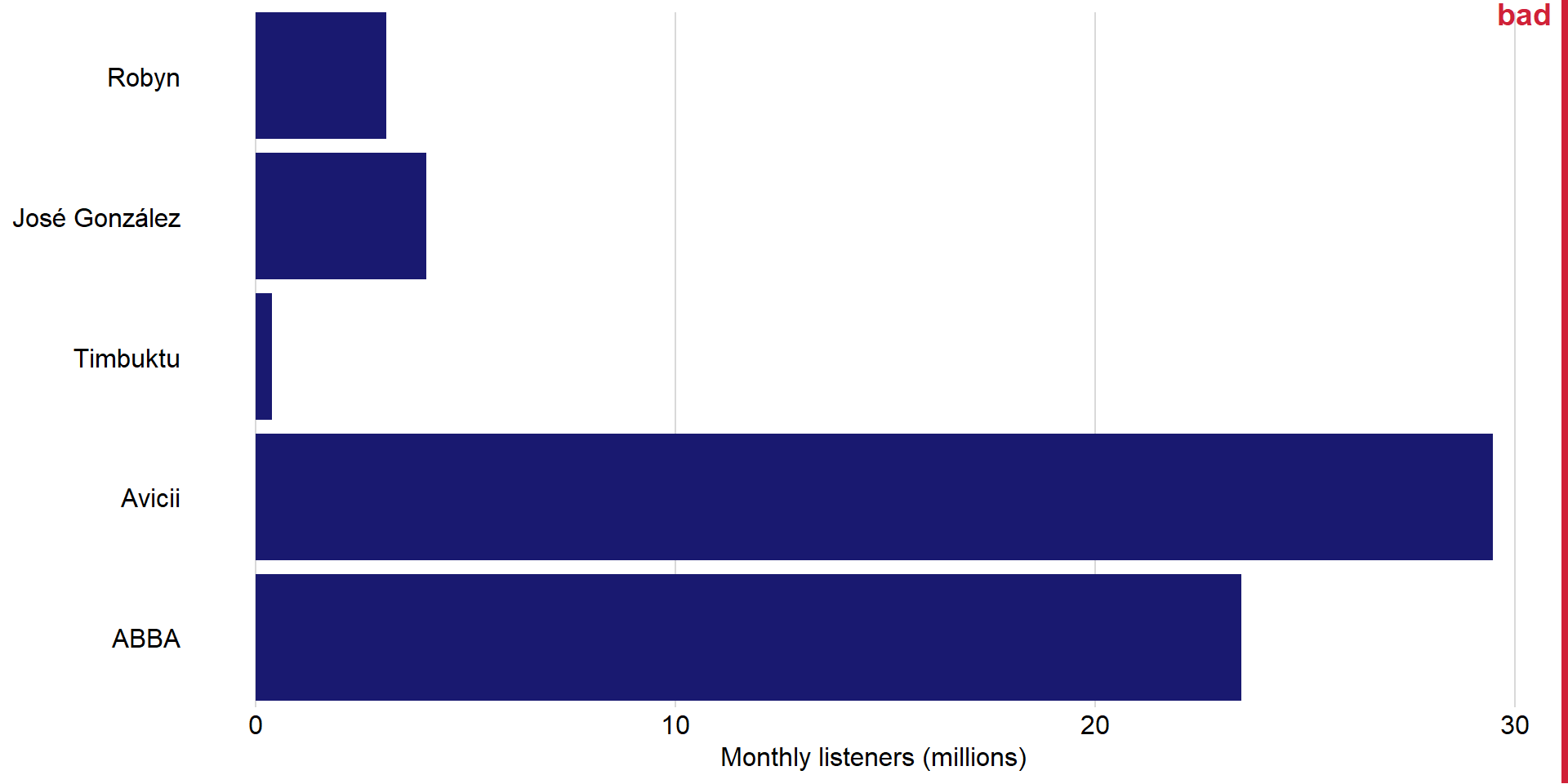
Pay attention to the order of the bars
![]()
We can use dots instead of bars
![]()
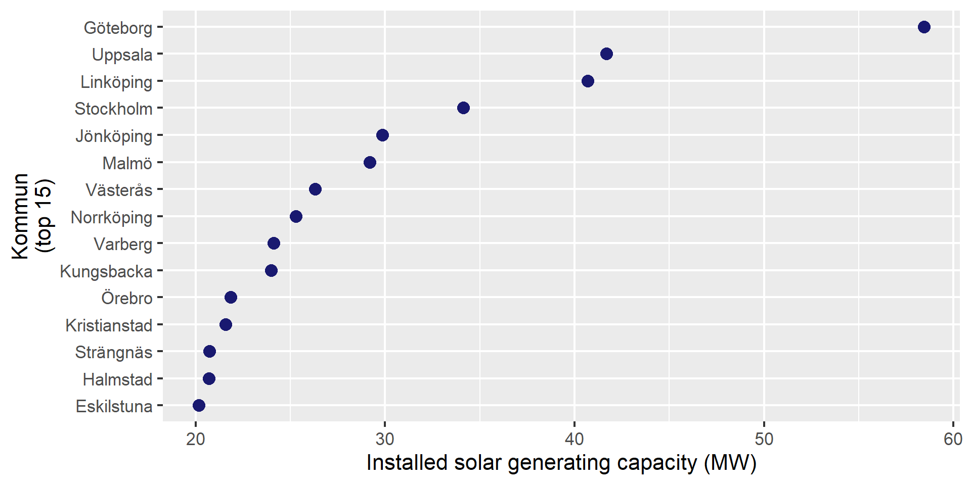
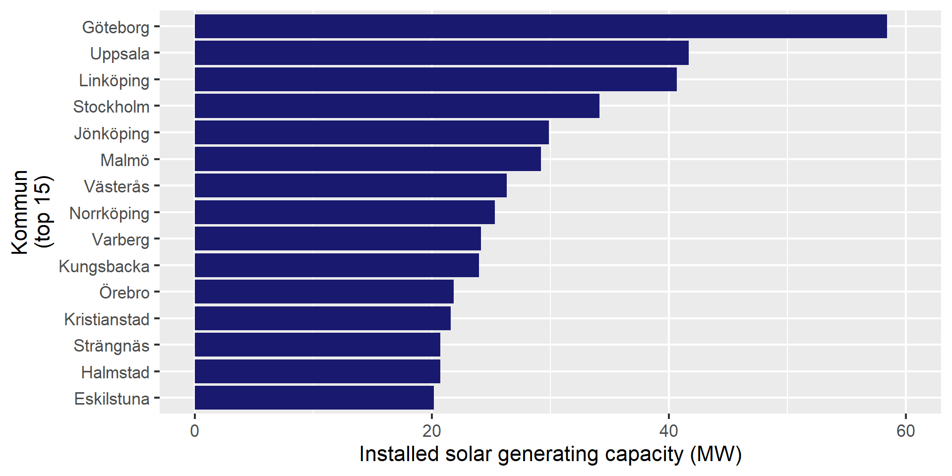
Dots are preferable if we want to truncate the axes
![]()
Dots are preferable if we want to truncate the axes
![]()
Dots are preferable if we want to truncate the axes
![]()